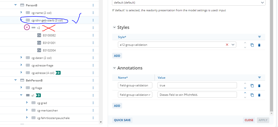
I am looking for a style or annotation that is able to display error messages for individual fields above the row or grid these fields are located in.
I know that there is the possibility in a form model to register a style called “a12-group-validation”. I can then use it as a control grid style and combine it with the annotation field-group-validation:true & field-group-validation-msg:“message” in order to display a single message set for all fields in that row of the grid in case any of their validation rules are triggered. But in this case I can only display this one set message for all the possible error-texts behind the different validation rules from the document model.
What I would like to do is just to change the display position of the error text from above the individual fields above the whole row/grid but keep their original error texts set in the document model.
Is there maybe another default style that accomplishes that? Or would I have to build a custom solution?
I’m not completely sure if this is what you are looking for but here’s what we do in our project. It’s not 100% modeling though:
We have a couple of repeatable groups where we have validations that check all entries (Is there at least one entry? Are there duplicate entries? etc). Per default, the error messages will be displayed on the first entry of the group which can be confusing (because there first entry might not be a duplicate) or lead to situations where the message isn’t displayed at all (when there’s no entry but there needs to be at least one). What we do, is that we use an invisible field above the repeatable group and the error messages are displayed on this field (that’s always there and always in the same position). This is what that looks like:
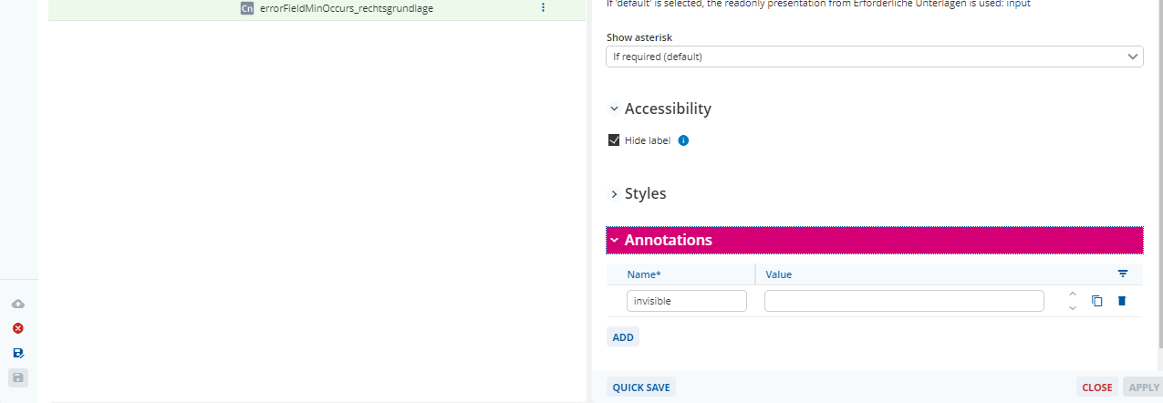
To get an invisible field, you can use the utility class “u-hidden” (these don’t work out of the box though but a developer needs to set them up for your application once)
or a frontend dev needs to implement this for your project (might make more sense/be less work if you don’t plan to use any other utility/helper classes). You can then make fields invisible by adding an annotation like this:
(we use a custom implementation which hides all fields that have the annotation “invisible”)
That sounds like a clever solution for repeatable groups!  But it is not quite what I was looking for.
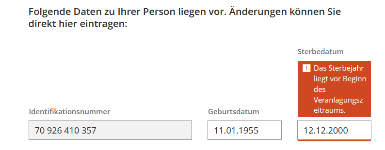
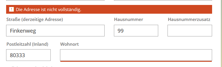
I currently have fields with their own validation/error messages, that are being displayed right above the field like this:
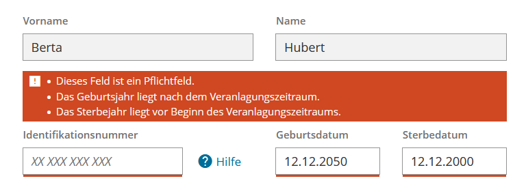
But instead I want these to be displayed above a whole group of fields like this example:
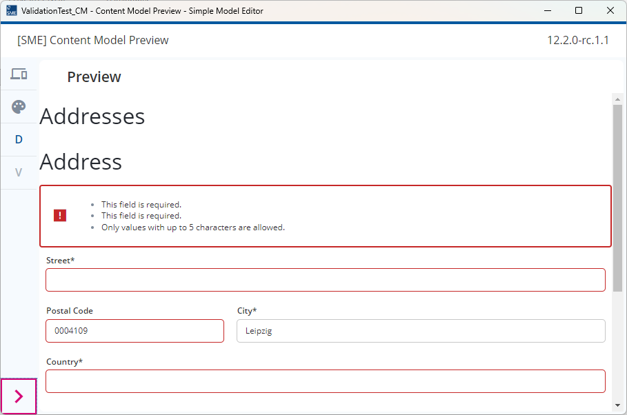
It turns out I only needed my afore-mentioned styles and annotations to do that. So at the end it looks like this (desired outcome):
Only the error text for ommision errors is being replaced by the field-group-validation-msg. But individual field error texts are still being displayed and also grouped if there are multiple of them.
The problem was that the style AND annotations needed to be applied to the control grid alone and not the row (even though rows allow entries for both; not sure if this is a bug).
Of course the style also needs to be registered in the settings of the form model under styles.
Huh, very neat! I’ve never heard of these annotations. Are those custom implementations for your project?
I tried setting this up like you showed in a workspace in the preview app and my error messages stay at their individual fields and aren’t displayed on the control grid level. Seems like this isn’t supported out of the box. I tried searching the documentation and the widget showcase but haven’t found anything. @malcolm-silver-ice & @felix-blazing-river , do you guys know anything about these styles or is this a project-specific implementation?
In case, anyone finds this later on: This is indeed a project-specific implementation for <PROJECT_NAME>. There is A12-13297 which would add this to A12 in general. So if you need this for your project, you need to push this ticket or ask somebody from <PROJECT_NAME> to show you their implementation for you to copy over for your project.
Hi @lea-clear-clover
I did exactly the same thing when I read:
I went straight to the documentation and didn’t find anything. As far as I am aware, these are project specific styles and annotations. If this changes, we will tell you about this (at the latest in a modeling release presentation) as this is something that modelers have been wishing for for a long time.
Talking about release presentations, if you happened to watch the Backstage session this week, you’ll already have heard about dynamic Content Modeling and the fact that this is coming in 2025.06-ext2. Dynamic Content Modeling allows you to input or display data from a document. This means that error messages also need to be shown based on the Validation Rules defined in the Document Model.
I’m aware that there is a group validation message element available in Content Models but this is not available for Form Models (A12-16272).
Unofficially, here’s a screenshot from the 2025.06-ext2 that we’re currently testing… as I say, more to come in the Release Presentations.
Hey everyone,
sorry for answering this late. I was ill the days right after I posted here and then on vacation. But yeah you figured it out on your own, that these are custom/not yet released styles and annotations.
I wasn’t sure myself, when I posted this back then.
I am glad to see though that this is slowly finding it’s way into other modelling projects with the next releases.