Hi,
before CSS in JS we´ve used Stylus in our project. Now with styled components we´re are forced to remove all Stylus classes etc…
To hide a field which was created in SME we´ve used the following code:
:global
  #a12-previewAttributesValidationField-field_406a1-group
    margin-bottom 0
    .field__input
      display none
or
:global
  .toko_hidden .field__input,
  .toko_hidden label
    display: none !important
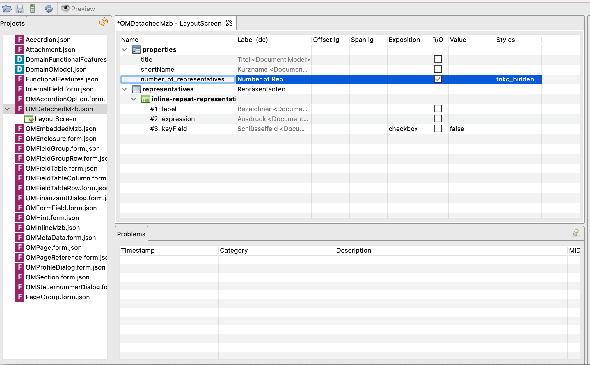
and set the class in the UI Designer:
How can we achieve the same result with styled components? Or is there maybe a checkbox “hide” for fields in SME or UI-Designer?
We use SME 8.2.2 and UI Designer 34.4.1 (A12 Tools - 2022.06).
Thanks
Hi @michael-thin-timber,
As a modeler, I have two questions / solutions:
-
Do you ever need to view the field on the form? If not, just remove it from the form model
-
Do you want to be able to choose, when the field is visible? If yes, you can model a dependency.
These solutions might not be appropriate as I think you are generating you form models automatically. Is that right?
Hi @michael-thin-timber ,
as @malcolm-silver-ice mentioned you can use Dependent Field and there you can use the Hiden option to hide the dependent field.
After speaking to @michael-thin-timber it has become clear that they are looking for a different solution due to their use case.
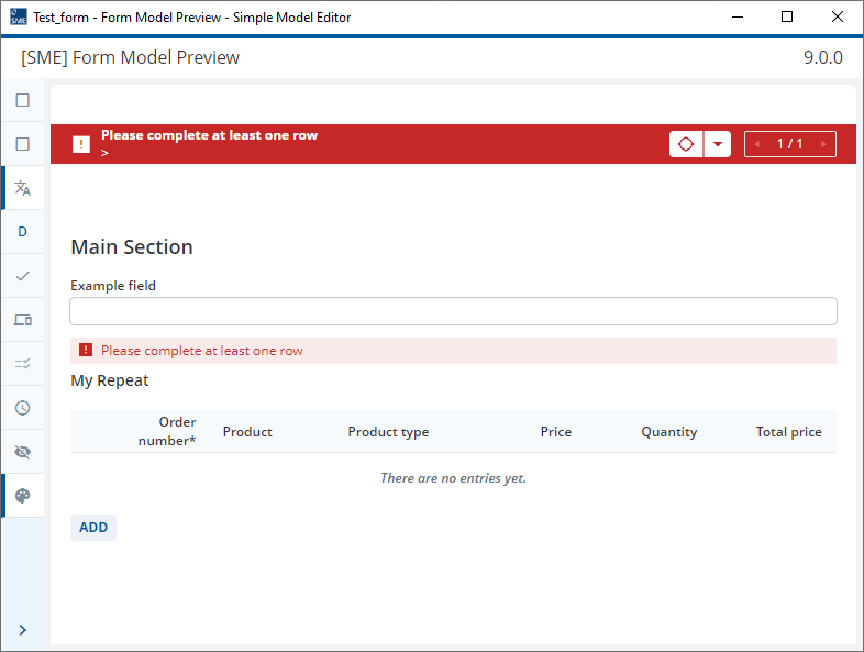
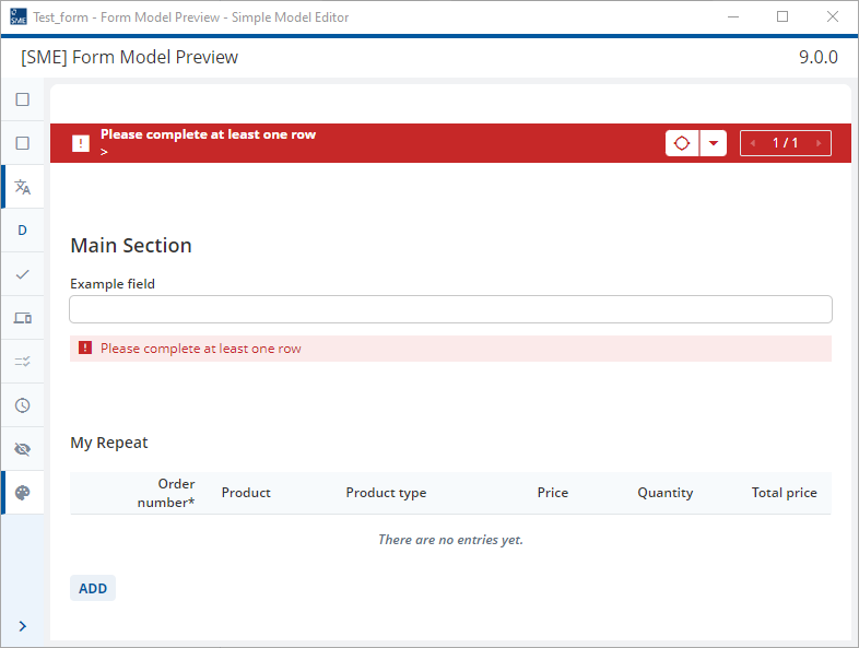
In this case, we need a field which can be selected as the error field in a validation rule. This is needed to show an error above a particular section in the form and relates to the fact that in A12, we always need to define a field from the document model on which error messages are shown and we cannot use a UI element.
The workaround in this case is to use helper classes shown in the Widgets showcase.
-
Set the “number_of_representatives” control to read only (already done in the picture shown in original post)
-
Click on Edit → Model Settings and add the helper class h_transparentBG to the comma separated list of styles
-
Right-click on “number_of_representatives” control and select Edit Styles.
-
Set a check next to the h_transparentBG style
The control will now be transparent but will take up the normal amount of space. This leads to an apparent line break in the form. Unfortunately, there is not way as a modeler that we can reduce the height of this control. If the validation rule is triggered, the error message will now be displayed above the transparent control.
@michael-thin-timber You can still use your own CSS class, it’s not force to move away from CSS. You need, however, to refer to our widget using different way, e.g. data-role instead of using Widgets CSS class.
Your code can be rewritten like this:
  .toko_hidden [data-role='textline-input'],
  .toko_hidden [data-role='textline-label']
    display: none !important
@malcolm-silver-ice @ahmad-warm-vale @binh-deep-cache thanks for your answers and your help!
I´ve talked to @malcolm-silver-ice yesterday and he showed me a solution with helper classes! This is actually not really working in our project, so I needed to find another solution!
@binh-deep-cache:
The problem is, we want to get rid of stylus and classes. At the moment it´s implemented like this:
In file om-profile-dialog-details.container.styl
:global
  #a12-previewAttributesValidationField-field_406a1-group
    margin-bottom 0
    .field__input
      display none
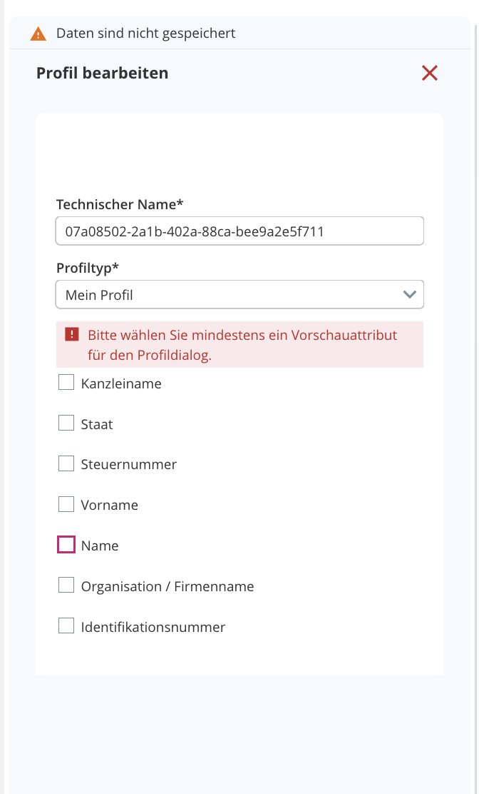
This is how it looks with stylus and the class above:
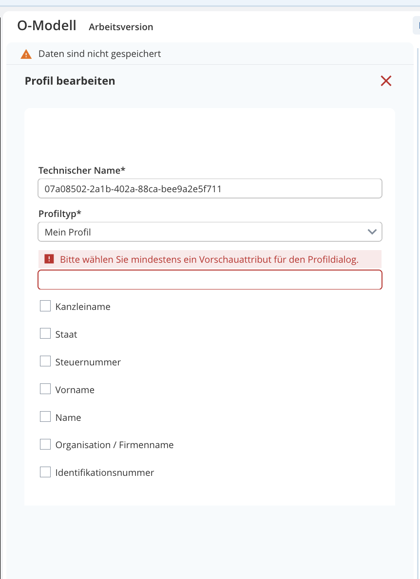
And this how it looks when I remove the stylus file (the input is shown):
Actually in our code we´re using a div as a container and I might found a solution to get the same result with styled components. Here´s my solution:
export function ControlWrapper(props: CompProps) {
	const { controlProps, defaultDetails, nodeType, resetToDefault, removeReference } = props;
	return (
		<StyledControlWrapper>
			<DefaultFormModelMap.Control.component {...controlProps} />
			<ControlWithDefault {...{ controlProps, defaultDetails, nodeType, resetToDefault }} />
			<ControlWithReference {...{ controlProps, defaultDetails, nodeType, removeReference }} />
		</StyledControlWrapper>
	);
}

// Styled Components:
const StyledControlWrapper = styled.div`
	display: flex;
	align-items: flex-end;

	&
		> div[data-role="textline"]
		> div.field__main
		> div[data-role="textline-control"]
		> div[data-role="textline-input-wrapper"] {
		display: none;
	}
`;
I´ve tried to get more specific with the id of the input field but it´s not working…another problem might be in future if the structure is changing!
If you have any suggestions would be nice 
Thanks
Hi @michael-thin-timber data-role is our API and hence will not change without notice. The code you wrote is similar to what I suggest.
In your code there is still a reference to .field__main which can be problematic.
Thanks @binh-deep-cache…your answer before with the data-role helped me with my code
The problem with the .field__main is that there is no data-role included:
My thoughts are to select
div[data-role="textline-input-wrapper"] if input with id #a12-previewAttributesValidationField-field_406a1 is included but i can´t. I´ve tried eg:
&
		> div[data-role="textline"]
		> div.field__main
		> div[data-role="textline-control"]
		> div[data-role="textline-input-wrapper"]:has(#a12-previewAttributesValidationField-field_406a1) {
		display: none;
	}
or :has(> input#a12-previewAttributesValidationField-field_406a1)
But that is not working. What would you suggest?
Thanks
With the solution so far I get further problems in other details…so this is also not working if can´t get more specific ;(
Hi @michael-thin-timber,
I was testing this workaround further and found this section of the widgets showcase.
I added the style, -u-height-1, to the list of styles on my form model so that I had two styles, -u-height-1 and h_transparentBG.
I then setup the “number_of_representative” control as previously described. I then added the style “-u-height-1” to the row that “number_of_representatives” was in in the form model. The result was that the read only control used to show the error message was now smaller and an error message could be shown directly above another section.
Please note without this second style, the form looked like this:
Hey @malcolm-silver-ice,
thanks for your help Actually I´ve found another solution, which is working quite well in our project.
Here are the steps:
UI-Designer:
-
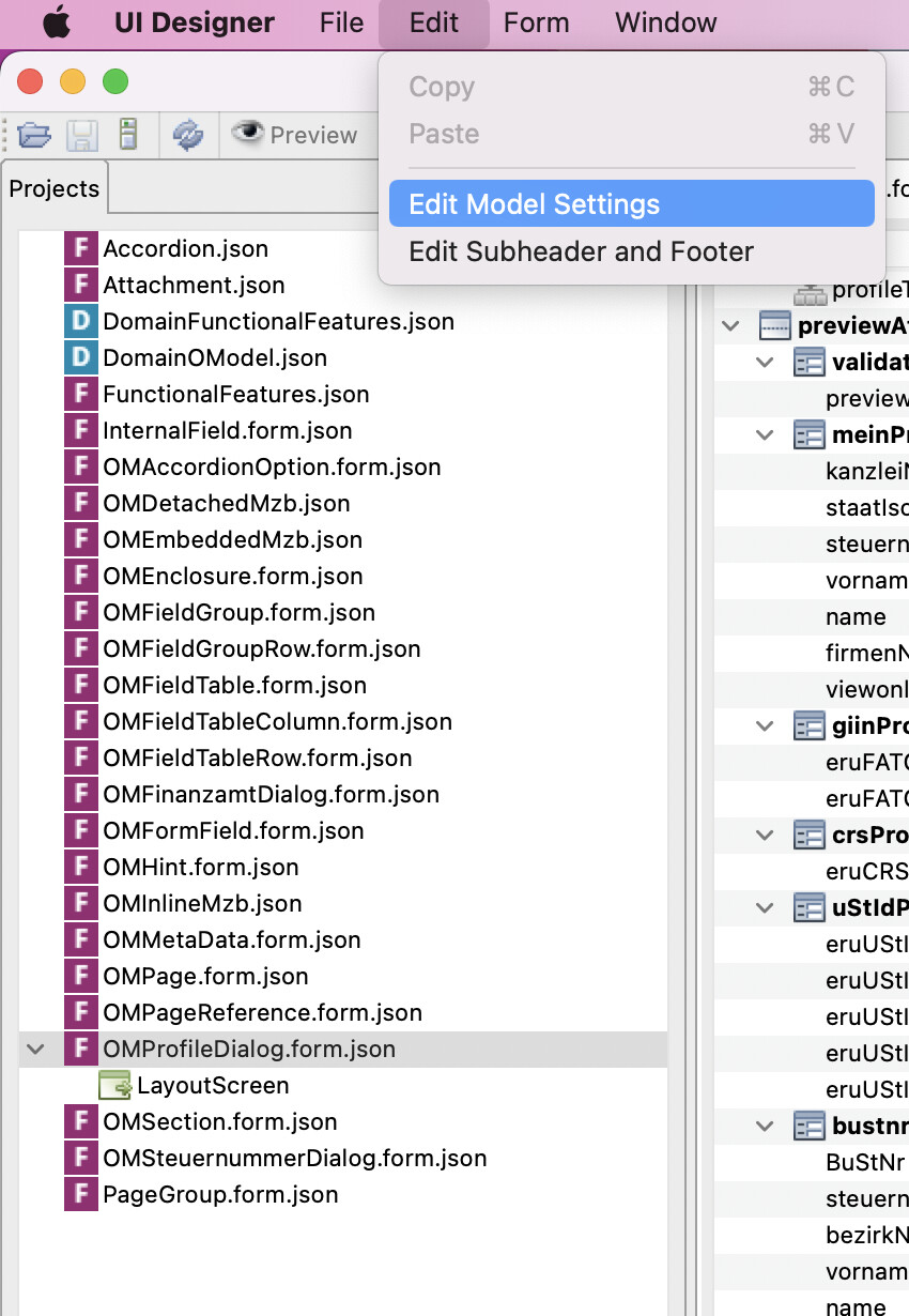
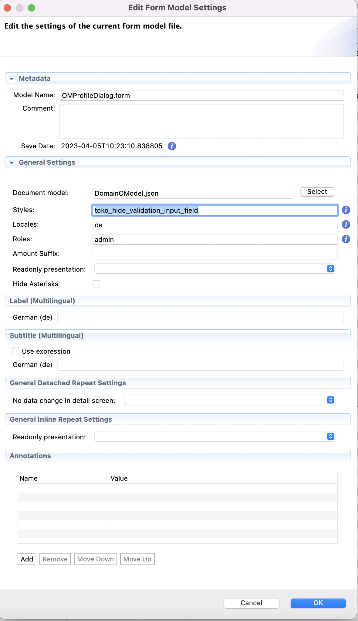
In the UI-Designer I´ve opened the layout screen of the form model (in our case OMProfileDialog.form) and then clicked on Edit → Edit Model Settings
-
In General Settings → Styles: I´ve created a new custom class toko_hide_validation_input_field
-
The class toko_hide_validation_input_field needs to be attached to previewAttributesValidationField under Styles
Code:
- in the Details Container:
const Container = styled.div`
	/**
* Example:
* The .toko_hide_validation_input_field class is defined and used in the A12 UI model.
* It is attached to the field previewAttributesValidationField and it is used to hide the input field and just show validation message for a group of checkboxes
 */
	& .toko_hide_validation_input_field [data-role="textline-input-wrapper"] {
		display: none;
	}
`;
There´re different ways to solve the problem. But we´ve decided to put the class in the details-container. And it works quite well in our project.
Thanks for your support and your help!